Color predictions for 2018
Source:woodworkingnetwork
Closets & Organized Storage takes a look at what four major interior paint companies think will be popular in 2018.
With the fall/winter season comes a fresh look at home décor color trends as well as color of the year announcements for 2018. Most recently we’ve seen various shades of blue and natural and neutral tones rise in popularity. On these pages, Closets & Organized Storage takes a look at what four major interior paint companies think will be popular in 2018.
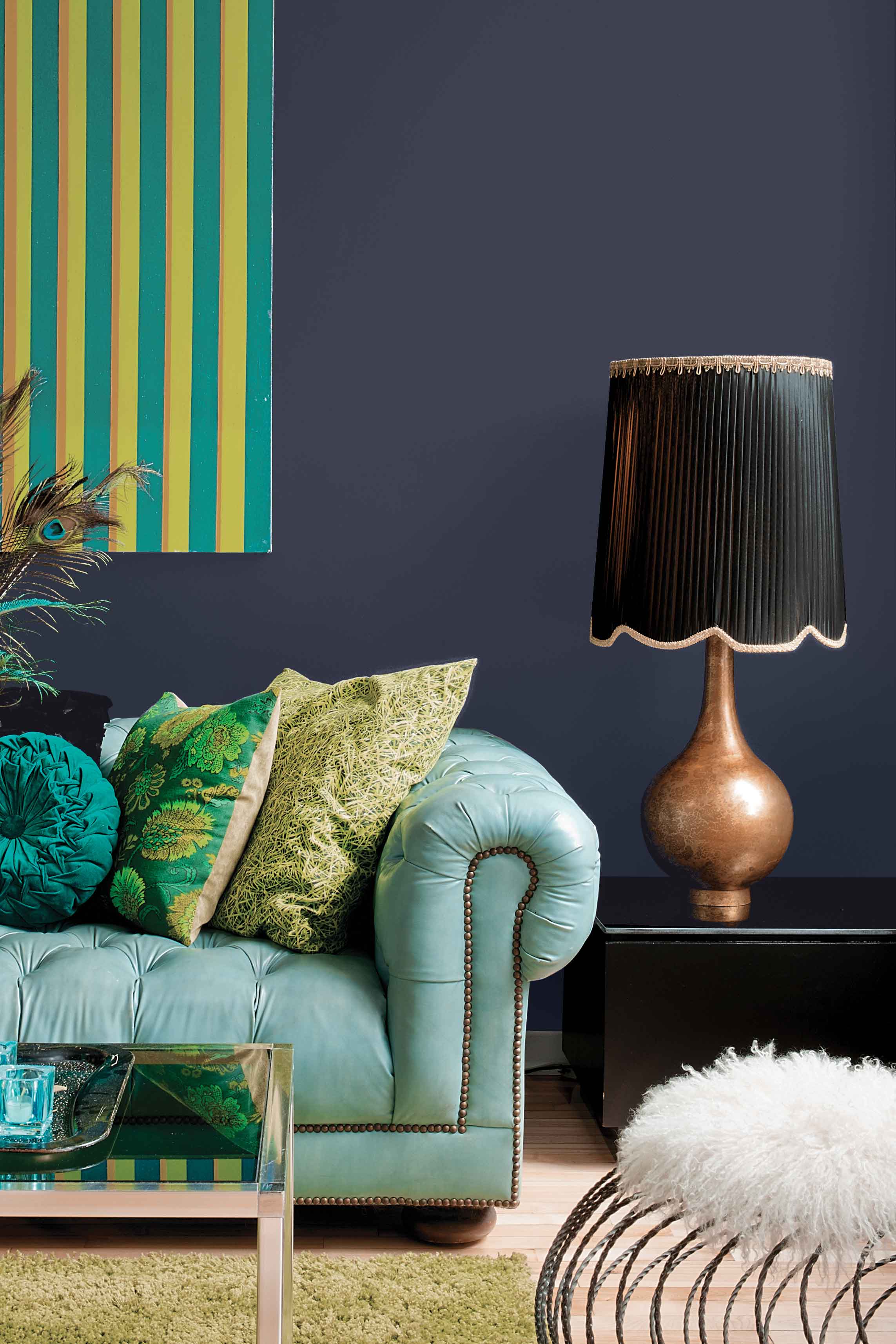
PPG Paints: Black Flame
PPG Paints color experts named Black Flame (PPG1043-7) its 2018 Color of the Year. The company says this new neutral – a statement-making black, infused with an undertone of the deepest indigo – evokes the privacy, hope and classic modernism that many consumers crave today. Embodying the spirit of a tailored suit, tuxedo or a little black dress, it is dressed-up, coveted, unapologetic and – most importantly – timeless.
“Black Flame acts like a black curtain, allowing your other décor elements to take center stage,” said Dee Schlotter, PPG senior color marketing manager. “It’s a fantastic blend of black and indigo, two classic hues. Black creates the silence we crave in an information-heavy world, while the indigo offers possibility and a deep hopefulness. The blend of two colors makes it incredibly versatile – use it on a statement wall, with a matte finish on a ceiling, with high gloss on a naturally-lit staircase, on cabinets, interior and exterior doors, and in many more places. The versatile hue can also provide strength and a modern luxe vibe to spaces with a lot of whites, blush pinks and soft pastels.”
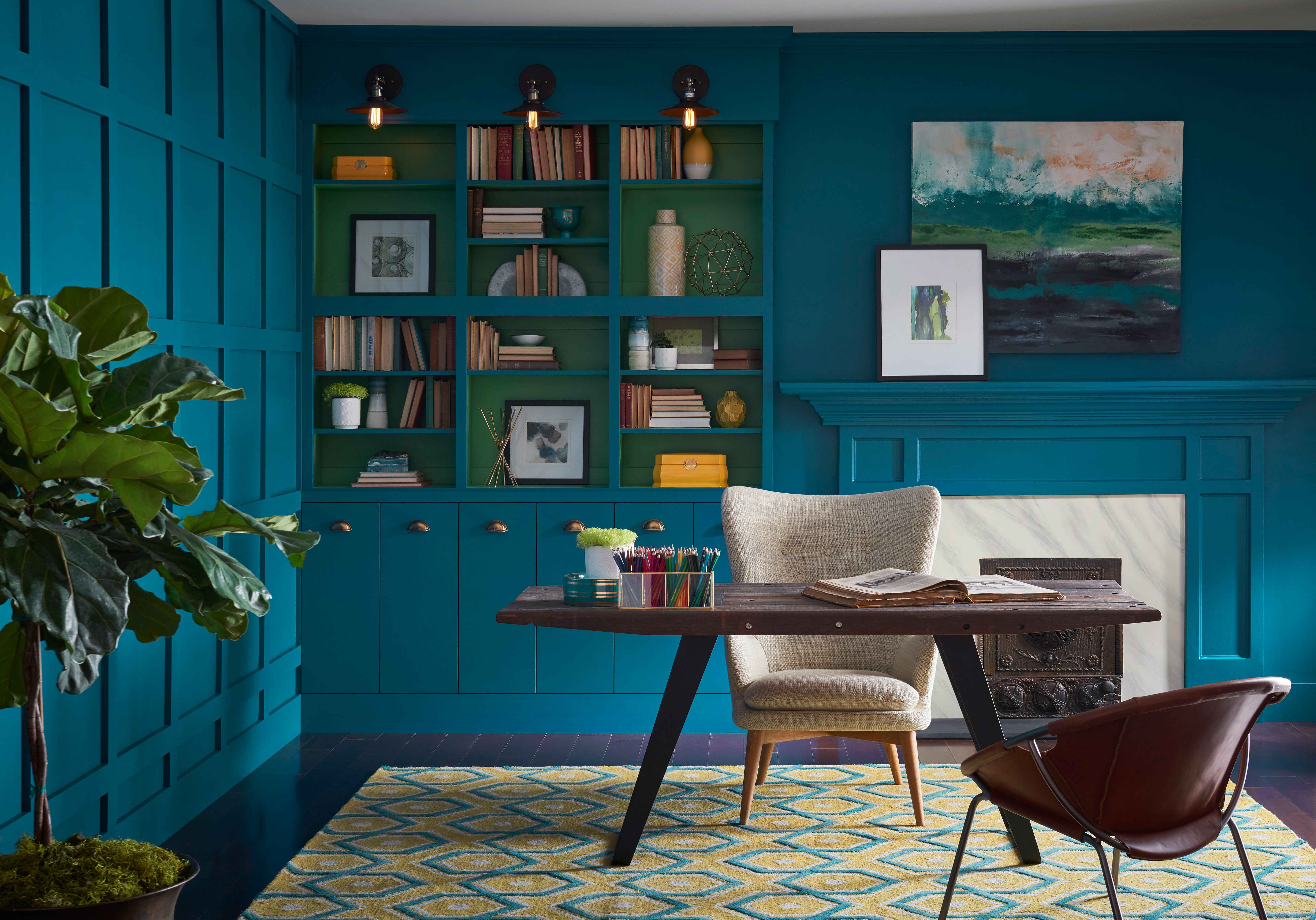
Sherwin-Williams: Oceanside
A fusion of rich blue with jewel-toned green, the 2018 Color of the Year for Sherwin-Williams is Oceanside SW 6496, which represents the growing desire for color that is both accessible and elusive. A complex, deep color, the company says Oceanside offers a sense of the familiar with a hint of the unknown, bridging between old and new, light and dark.
“Green-blues in deep values, such as Oceanside, respond to changes in light, which is a quality that creates intense dimension,” says Sue Wadden, director of color marketing at Sherwin-Williams. “It is a tremendously versatile color, and harmonizes with other diverse color groups.”
Blues evoke a multitude of moods and associations depending on hue, shade and application, she explained. Despite this variety, they are universally perceived as intelligent, honest and interesting — making blue the most beloved color worldwide. Oceanside’s multi-dimensional look not only can create a welcoming statement as a lively color for a front door, this green-meets-blue tone can also boost creative thinking and clarity of thought in a home office, or invite meditation and introspection in bedrooms or reading nooks.
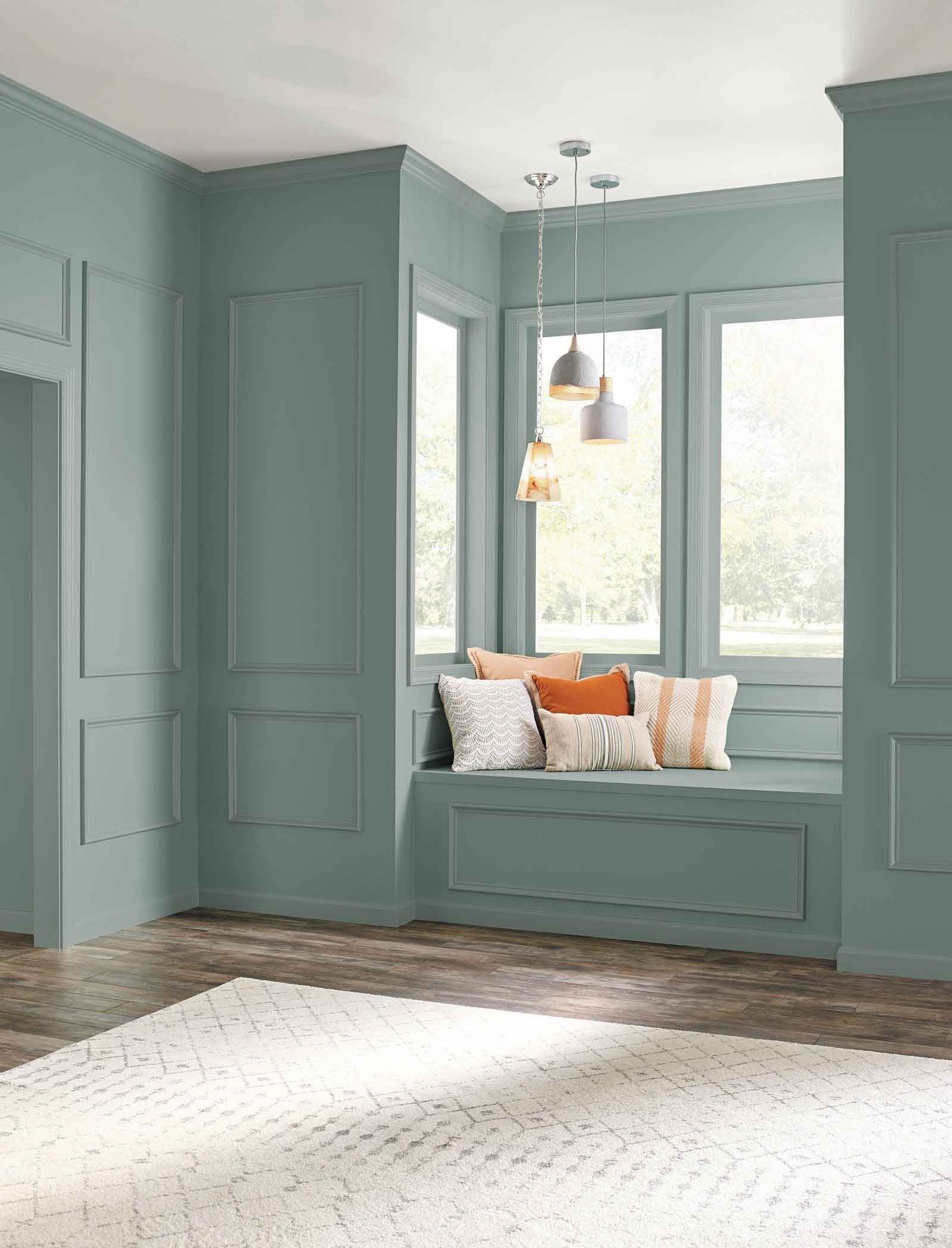
Behr: In The Moment
Also loving the blues, Behr announced its first-ever Color of the Year: In The Moment T18-15, a restorative blue-green hue honoring nature to create a soothing atmosphere. Versatile and welcoming, this grounding neutral is a serene backdrop to spaces where you unwind and recharge.
“In The Moment speaks to our society’s desire to disconnect and be present,” said Erika Woelfel, vice president of color and creative services at Behr. “Spruce blue, soft gray and lush green coalesce into a fresh shade that evokes a sense of sanctuary and relaxation amid our always-on lives. In The Moment crosses multiple design styles — global, coastal, modern — and pairs well with other subdued colors to create harmony for interiors or exteriors.”
The Behr 2018 Color of the Year was introduced alongside the annual Behr 2018 Color Trends palette, a spectrum of 20 hues forecasted to influence décor and design in the year ahead. The new palette captures the ever-evolving perception of “home,” which is brought to life today in New York City with an experiential BEHR Pop-Up Trend Home in the iconic Grand Central Terminal.
Benjamin Moore went with a vibrant, charismatic red – Caliente AF-290, as its Color of the Year 2018.
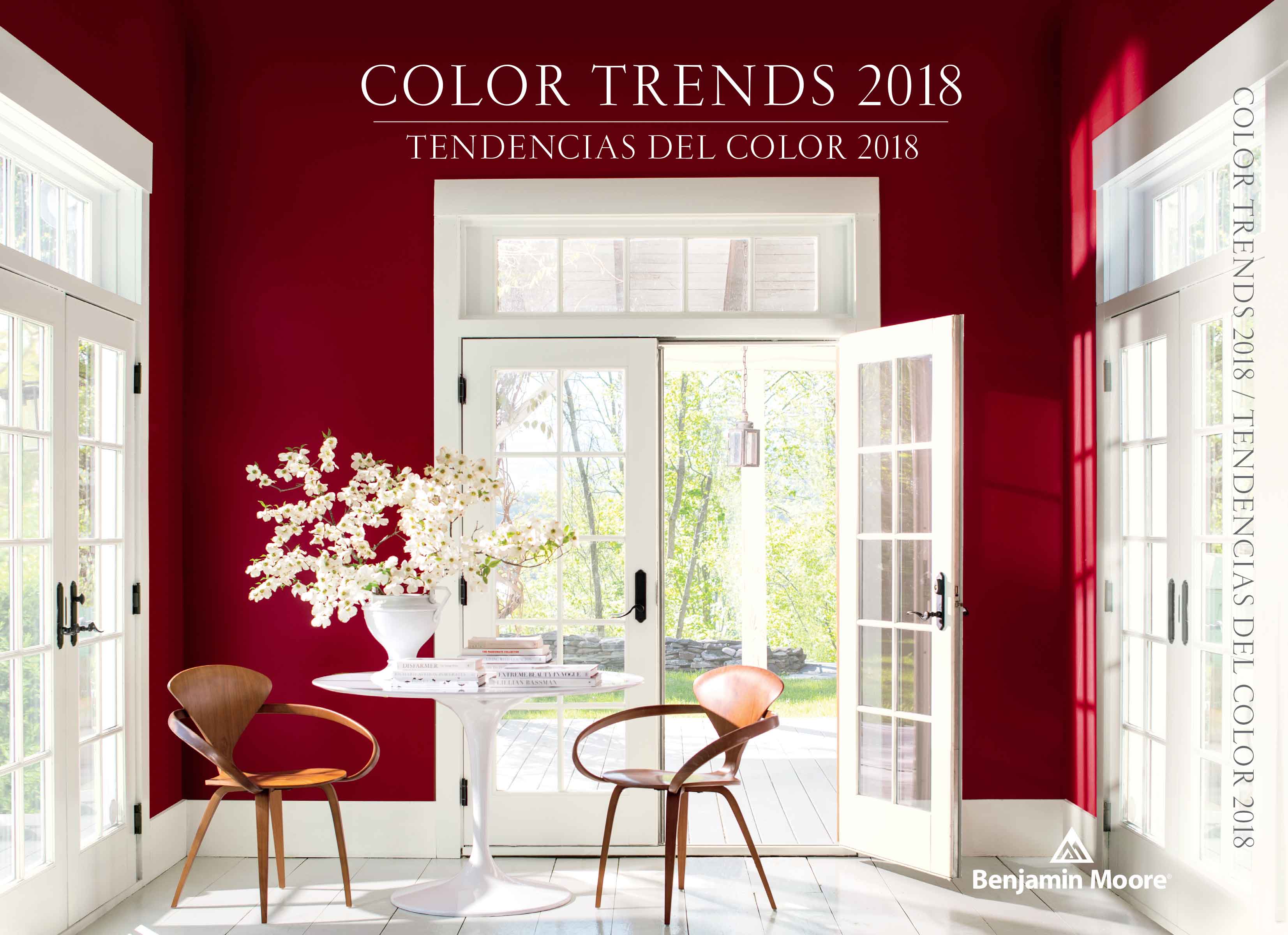
Benjamin Moore: Caliente AF-290
“Strong, radiant and full of energy, Caliente AF-290 is total confidence. It is pleasing, passionate and makes people feel special, like ‘red carpet treatment’,” said Ellen O’Neill, Benjamin Moore Director of Strategic Design Intelligence. “Whether used as one note or on four walls, the spirited personality of red turns heads signaling surprise and adventure. The eye can’t help but follow its bold strokes.”
Benjamin Moore also recently unveiled its Color Trends 2018, a curated palette of 23 highly influential hues that can be used to enliven any room by adding depth and energy. The palette incorporates a full spectrum of reds, from hints of blush to deep oxbloods, while ensuring seamless pairings with a carefully selected range of whites, neutrals, and complementary bold hues.
(Source:woodworkingnetwork.com)



 沪公网安备31010402003309号


