RIGI design renews a single family building in Shanghai and lights it up
Source:designboom
he original building was completed in 1947 — it consists of 3 floors, 5.5 meters in width, and about 15.2 meters in depth.
RIGI designed a white 3-story residence in a common shanghai old-style lane. there are plenty of similar buildings in the city which are not new, and located in naturally-formed blocks — carrying the memories of the city.
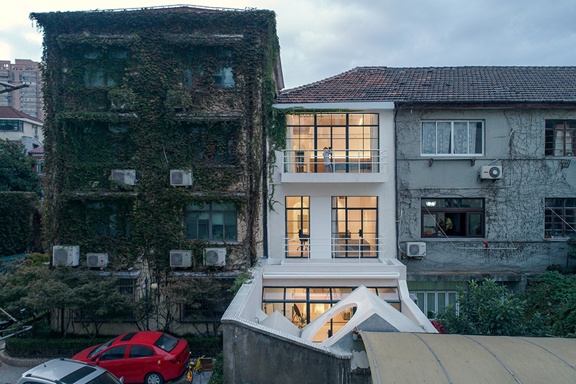
the building is located in shanghai
all images © tiam fangfang
the original building was completed in 1947 — it consists of 3 floors, 5.5 meters in width, and about 15.2 meters in depth. it faces south and has entrances from both sides. due to the complicated compartments and deep depth, the overall indoor lighting was bad. as it was built a long time ago, part of the building structure needed to be repaired and reinforced, RIGI unified the height of the entire building as well.
the architects unified the height of the entire building
the staircase in the northern side was torn down, the skylight and staircase are designed to be central objects, reshaping the whole logic and form of this 3-story building. with its punched holes, the steel stairs can bring in light. it goes upward around the natural light patio from the 1st floor, extending the whole house vertically around the light.

the staircase is designed to a central object
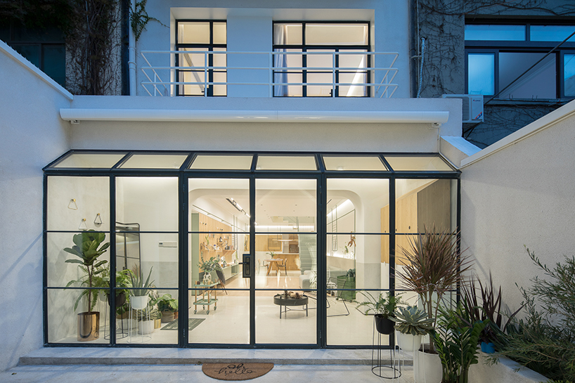
the architects designed a semi-opened area on the first floor which blurs the boundary between indoor and outdoor. after reconstruction, the original isolated courtyard has a new connection with the 3-story space. the semi-outdoor area adds enough warmth into the living room. sunshine, plants, interior, exterior, and blurry boundary allow spaces and the life scene to switch freely. a hole is reserved in the courtyard, which is where trees are intended to be planted in spring, that could accompany the kids when growing up, signifying the importance of the element of time is to the design.

sunshine, plants, interior, exterior, and blurry boundary allow spaces and life scene to switch freely
on the first floor, the sunny living room and the kitchen are designed as a single space, where the family can spend most of their time together. this space belongs to every scene of life, instead of being defined by functions. a modular furniture wall called ‘life board’ is designed, which can be decorated or assembled by accessories in diverse ways. from this point of view, the future form of the design could be gradually shaped by daily life.
 a modular furniture wall is designed on the first floor
on the second floor, the door and the storage space are hidden behind the wall, which creates a clean and complete area. during sunny days, it will be a warm family space. the kid’s bed, desk and storage space are connected through the design, which is very playful as they can climb stairs and play in the courtyard. this element brings a bigger world to the children, allowing them to know about the changing world from another dimension.
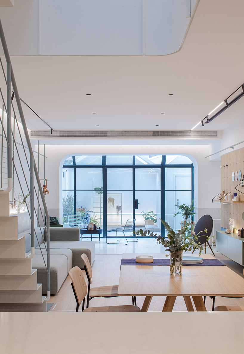 the living room and the kitchen are designed as a single space
following natural daylight, going up along the steel staircase, we can see modified skylights, vertical lighting windows and a pure outdoor space. the whole building starts from light and vertical space. for the main bedroom, the slope structure of the original building is kept, the cloakroom and the toilet are unified into a box, reserving the original architectural form to the largest extent and creating a new connection in the original space which is not big.
 he space belongs to every scene of life
‘we want to design something carrying beauty and happiness’, says the team. ‘there is not so much joy in life, and our life is filled with small happiness. what we love is not to possess good things or luxurious furniture, but a self-made life on our own. having seen so many houses, the only concept we believe is that a person cannot be stuck with a settled life, whether in the house value or style. a house is not equal to home, home belongs to us and our family. a house is like a container to carry our growth, experience and hope. and design brings more tolerance into life. the city where we live and work is not perfect, and there are even some disorder traffic and a lot of garbage, but it is not an obstacle for us to design a warm house. this is a house of 1970s, witnessing the lives of generations. at this moment it seems to be reborn’.

the stairs goes upward around the natural light patio
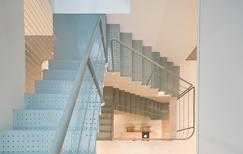
with its punched holes, the steel stairs can bring in light
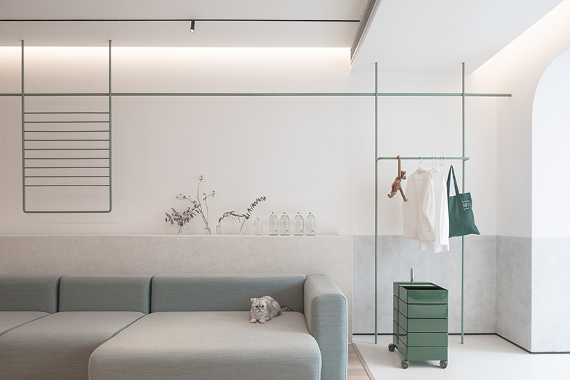 2nd floor
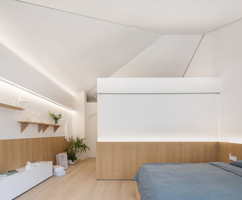
the bedroom
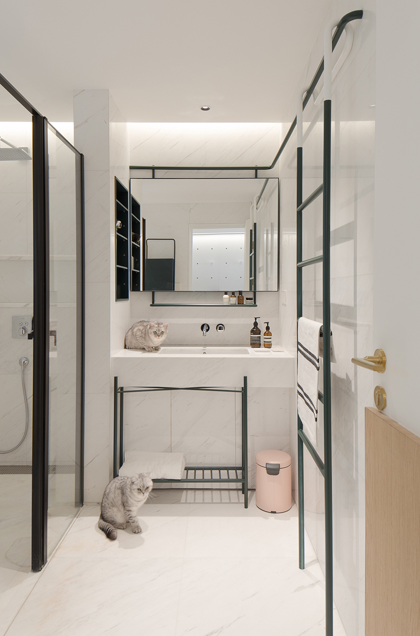 the bathroom
project info:
project name: a white house, a growing home
type: residence
design company: RIGI design
chief designer: liu kai
participating designer: yang junyi
photographer: tian fangfang
area: 240㎡ main
materials: metal plate, stoving varnish, felt, art paint, punched plate
completion date: 2017.11
location: shanghai
(Source:designboom.com)

 沪公网安备31010402003309号


