Wutopia Lab's pink and blue houses explore ideas of masculine and feminine
Source:dezeen
His House and Her House is a conceptual installation, which was aiming to discuss the contrasting roles of men and women in the kitchen and how this is reflected in dietary habits.
Chinese architecture studio Wutopia Lab painted a pair of houses pink and blue, filling one with meat and the other with flowers, to explore constructs around gender and food for an architecture biennale in Shenzhen.
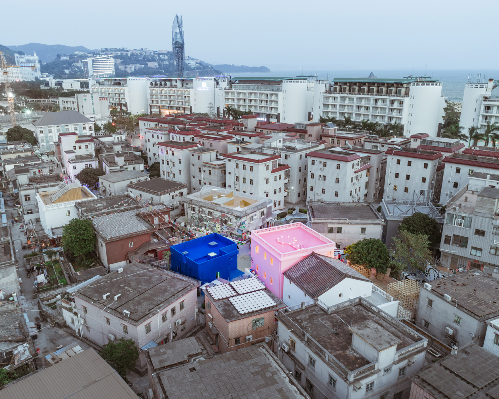
The organisers of the 2017 Bi-City Biennale of Urbanism/Architecture invited Wutopia Lab to renovate the two houses in Dameisha Village, an urban slum.
"His House and Her House is a conceptual installation, which was aiming to discuss the contrasting roles of men and women in the kitchen and how this is reflected in dietary habits," the architects told Dezeen.
Wutopia Lab believe that traditionally public kitchens are the domain of men, while women rule over private domestic kitchens.
The two houses are according to a binary concept of gender, distilling masculine and feminine energy into a vibrant blue house filled with bacon and wine, and a sugar-pink house veiled in fluttering curtains.
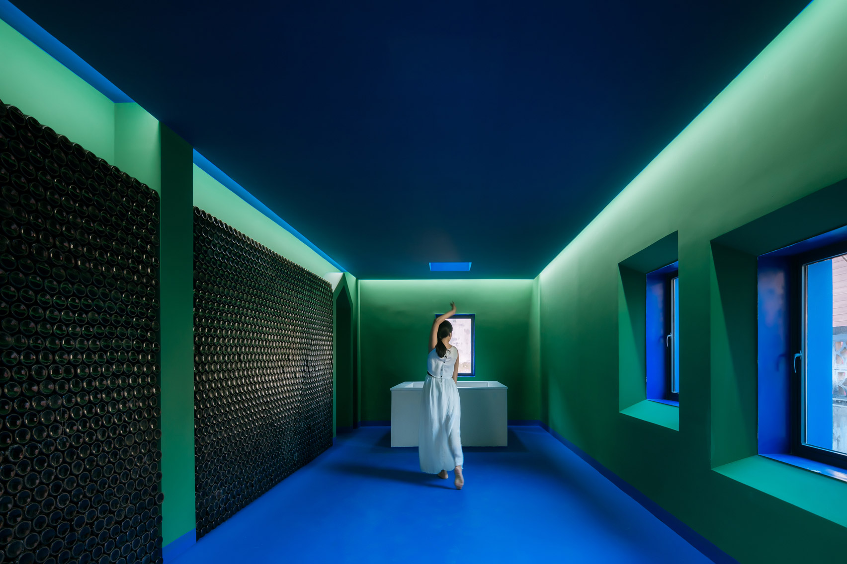
For His House, the architects painted the facade blue as a "symbol of survival and competition". Inside, the walls were painted green and the floors and ceilings blue, in a palette inspired by the paintings of French artist Henri Matisse.
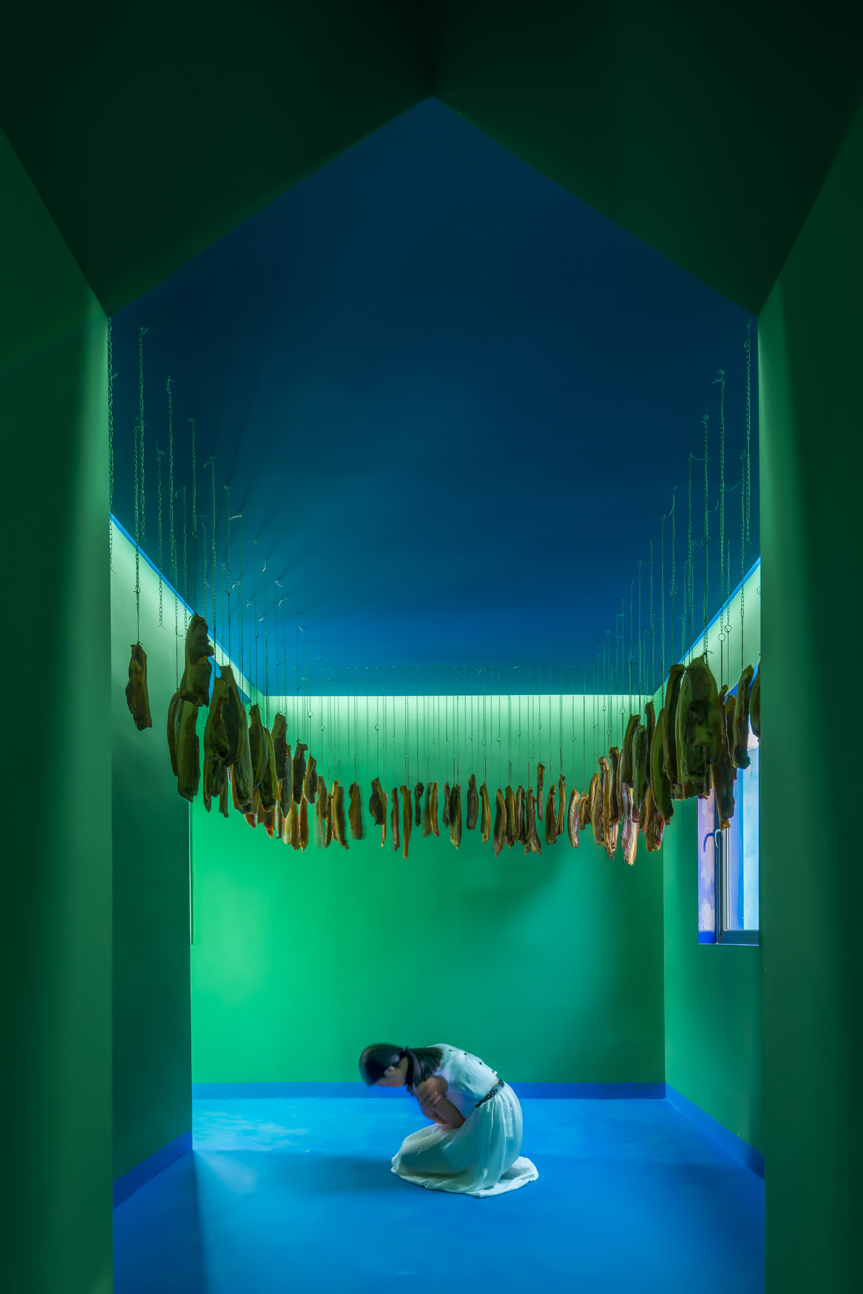
Inside, His House is filled with food and drink that symbolises the "desire for survival". The theme of Wine Pool Meat Forest alludes to the development of techniques to preserve food, namely fermentation and salting.
Visitors enter through a long gallery with walls lines with beer bottles and a pond filled with beer at at one end. In the next room, rashers of bacon dangle from the rafters like leaves.
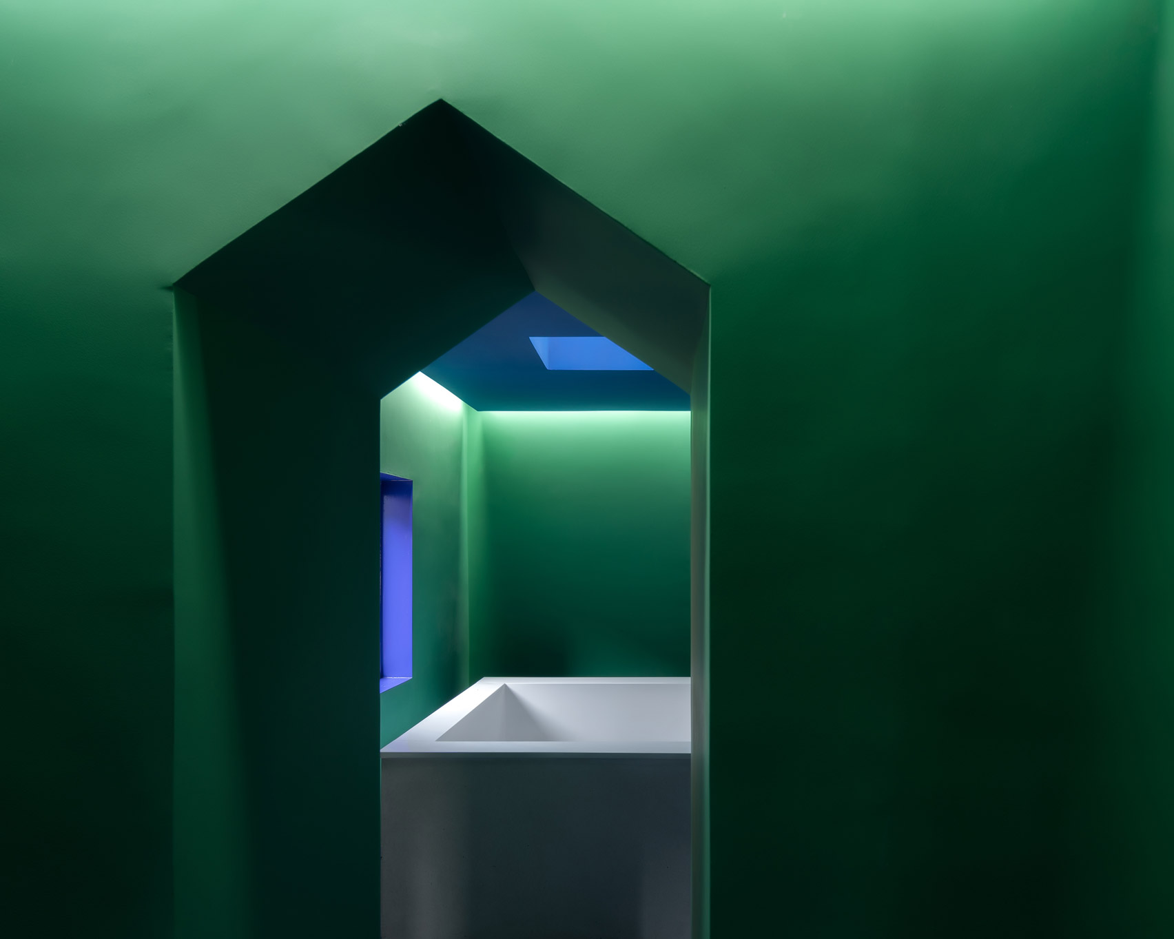
In the next room barbecues represent the most masculine of culinary endeavours: roasting meat on a fire. In the centre of the building's plan, a "secret room" for meditation, painted white and lit by a skylight, is filled with salt.
Salt is a common thread between the buildings. In the adjacent Her House, visitors enter through a walled garden and cross a patio covered in pink rock salt to match the pastel pink facade.
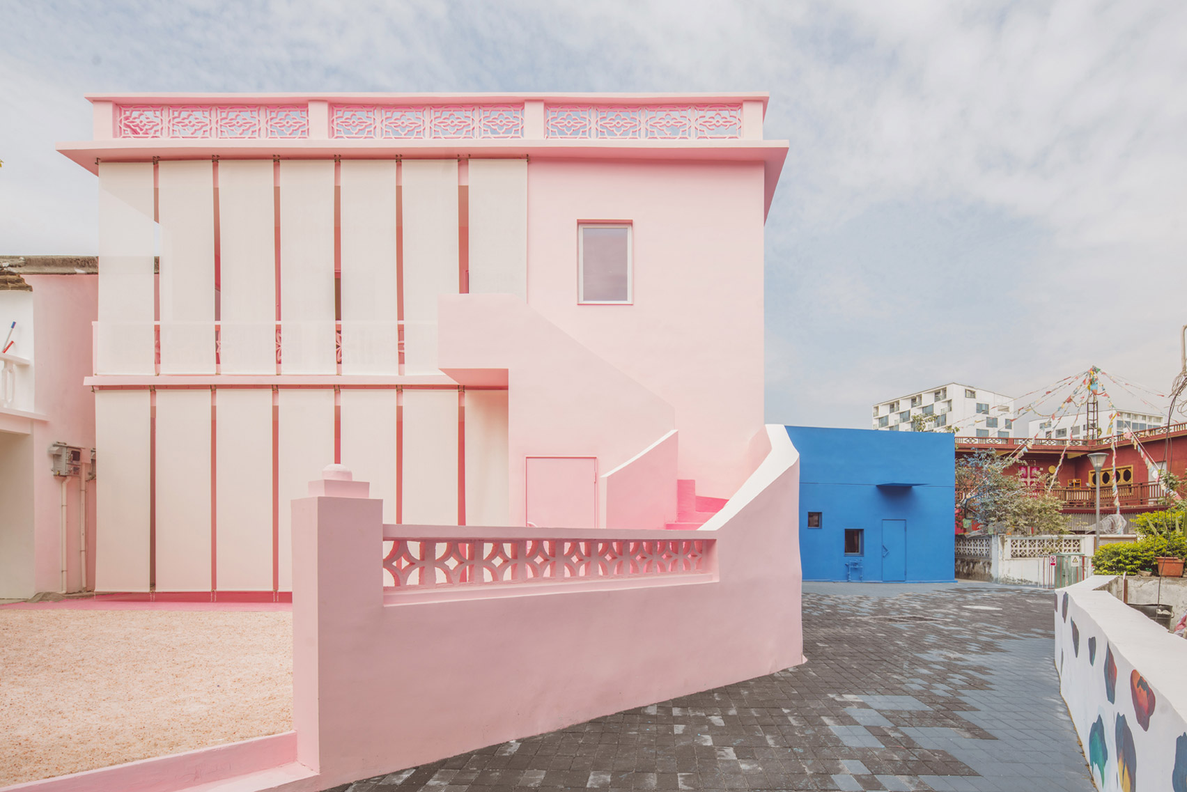
Her House is supposed to embody "sensitivity [and] delicacy" of the feminine. Outside, pale curtains shelter the veranda and a galleried balcony above in a "veil...implying the introversion of female life".
The Shanghai-based architecture studio recently designed a a cylindrical arts museum in Shanghai wrapped in a zig-zagging screen of perforated aluminium.
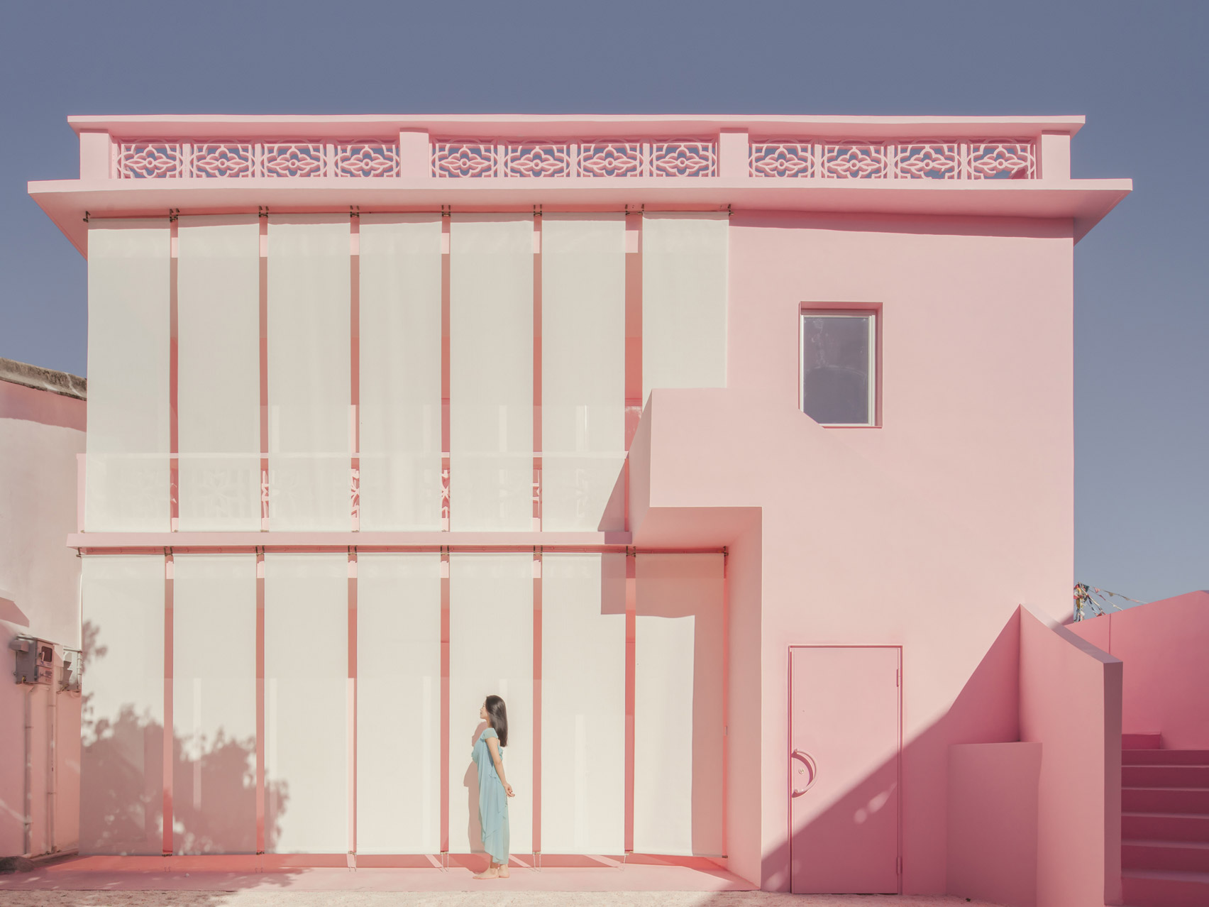
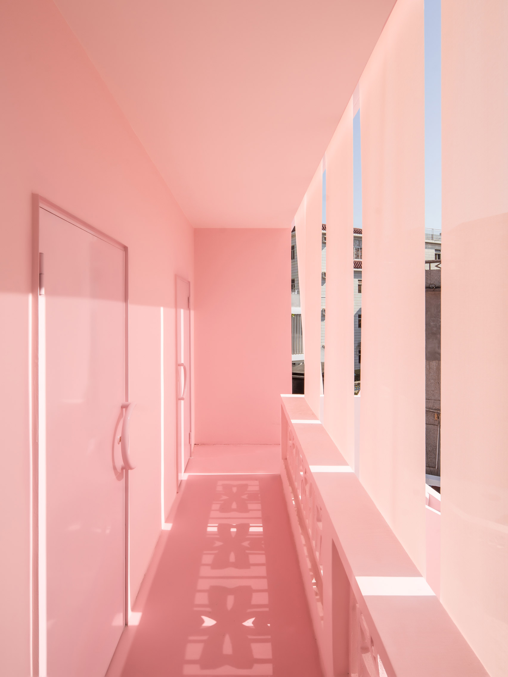
Inside Her House, various rooms cater to stereotypically feminine culinary pursuits. Downstairs, two bakeries correspond to the Orient and Occident, along with two rooms for afternoon tea.
Upstairs a labyrinth of rooms are assigned to ritualised elements of dieting and flower arrangements. There are rooms for "tonic diet", a "vegetarian diet" and two for blending, along with a pair of rooms dedicated to Ikebana, the Japanese art of mediative floral arrangement.
Wutopia Lab chose to keep the original and irregular windows of both houses, removing shutters and inserting glazing so that the buildings open on the square and give views to the adjacent house.
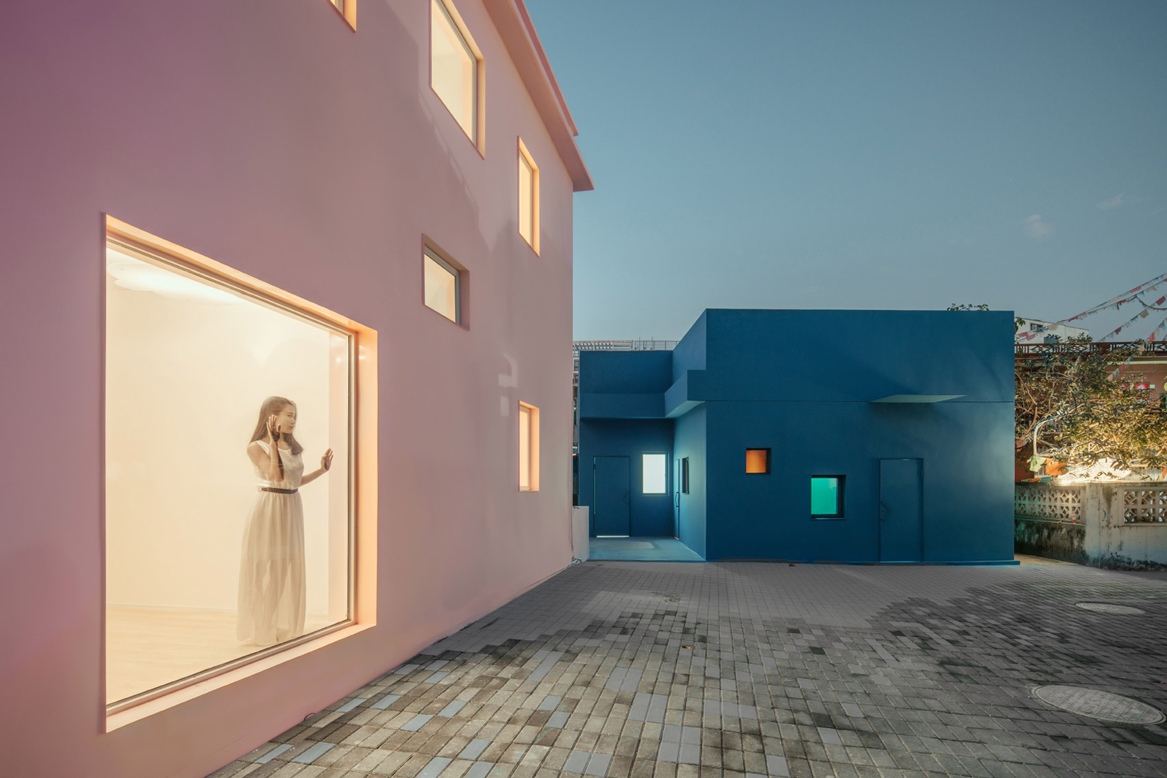
As well as visually signposting the dual nature of masculine/feminine, the blue and pink is a nod to the insulation materials visible in the urban fabric of the city.
Earlier this year Japanese furniture brand Muji opened its first hotel in Shenzhen. With its wood-lined walls and minimalist furniture in shades of white and grey, the interior styling is somewhat gender neutral in comparison.
(Source:dezeen.com)

 沪公网安备31010402003309号


